CLICK HERE FOR FREE BLOG LAYOUTS, LINK BUTTONS AND MORE! »

19 October 2012

Pink October

By now everyone knows that October is know as Breast Cancer Awareness Month or Pink Ribbon Month. Personally, as a family, we have not been touched by this cancer but I do know how it has affected others around me.
I do believe that because of the high media coverage, that breast cancer has gotten during October and because of all the monies raised from selling Pink Ribbons and merchandising the brand, the number of people, female AND male surviving this cancer has risen enormously.
This is good.

I  have a friend who has been just given the all clear from this awful disease. It was such a relief to hear and in part of celebration I sent her this card.

The backing papers were freebies that I got from a magazine a short time ago. I also used another card from this magazine as inspiration for the layout.
The image, is also a freebie that I have for ages it came in a pack of "Lili of the Valley" ready stamped images all I had to do was to colour it it.


I used pencils to colour the image, I blended the colours with some baby oil to soften the strokes. I used sukara pens to add sparkle to her dress and pearls.

Recipe:
Backing papers: Freebies from Cardmaking and Papercraft Magazines.
Image: Freebie - "Lili of the Valley" pack.
Colour medium: Pencils and Sukara pen.
Ribbons: Papermania capsule collection.

Hope you like,

11 October 2012

Blue and white

There are some colours that just go together like; brown and gold, green and yellow, black and white, navy and cream, well you get where I am coming from, but there is one colourway that reminds me of warm weather, Mediterranean holidays especially Greece.  It just gives the impression of been crisp and clean and that is...........

 Blue and White.


This is a card I made with out any images just relied on the colour scheme to give it -  oomph!

I embossed the card with cuttlebug swiss dots embossing folder. As the card is slightly bigger than the folder I used an edging punch along the bottom, put in a blue ribbon in between to finish the edge.  The blue and white die-cut panel came with the glittery blue border and the blue dots all I had to do was add the flowers and butterflies. Voilá, one crisp card.

Recipe:
Die-Cut: Papermania - Capsule Collection
Embossing: Cuttlebug - Swiss Dots
Flowers: Blue - Capsule Collection, Silver flowers from stash
Ribbon - Local haberdashery
Butterflies: Stash


Hope you like,

09 October 2012

A sad one this time,

I got word last Friday that a friend on the PCP Site had suddenly pass away. It was a shock to say the least. I had never met Cathie, in real life, but as I read her posts, her comments, received mail from her and joined in swaps with her, I got to know her.

What is a friend? Do you have to have physical contact to be friends?
I don't think so.
I think friends are people you have a connection with, you have commonalities with, share a sense of humour maybe. It is someone you choose to spend time with, in this case on the computer, spending time making something special for them, "speaking" to them, taking time out of your life to read what they have to say and telling them whats going on in your life.
OK, you cannot run over for a cut of tea and a chat, you cannot be a shoulder for them to cry on or someone to give a hug of congratulations when something wonderful happens for them but with the advent of the Internet and skype it makes meeting people from all over easier. Also makes life a little more interesting.

But I digress.

As last Saturday was International Card Making day, I decided to make a card in Cathie's memory.

 
I used Kraft card for the base and Graphic 45 paper as the designer paper. Cathie had just started a discussion group on PCP for Graphic 45  as she really liked it. I agree, it is very nice paper, the quality is great and the colours are vibrant and easy to work with.
The image is an original by Cathie, herself.
 
The teddy is setting on a "cushion" reading his book. When I was attaching the teddy to the backing paper, it just looked as it was floating in mid air, it need to be grounded, could not figure out how to do this for ages, I did not want to use ribbon as I wanted to keep the card a masculine card, the bakers twine did not suit. I did not have any chair images that he could sit in.  I was looking around my craft room for some inspiration when I spotted Tiny's bed that he had chowed on while board one day and some of it contents lay on the floor. Light bulb moment, a cushion, Teddy could sit on a nice soft fluffy cushion. That's what he is sitting on, some of Tiny's bed. Sorted!
 
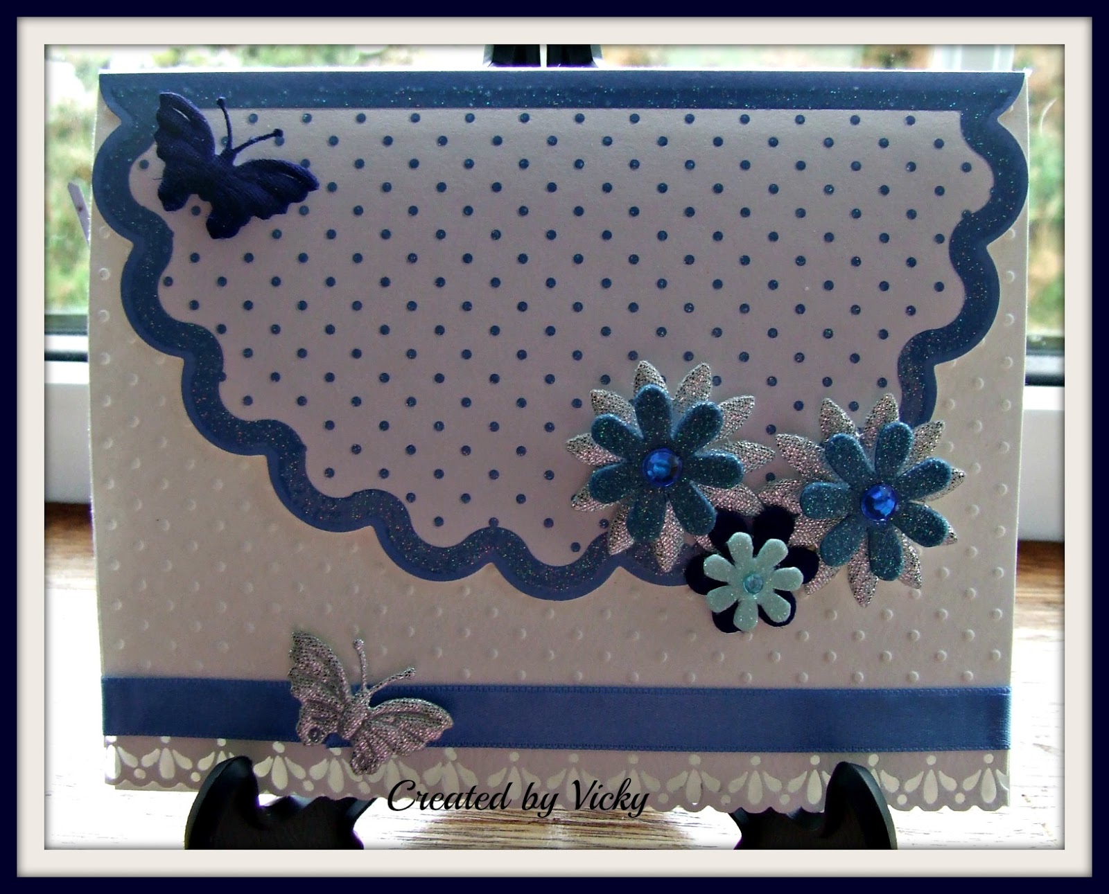
The card fold, is like a smaller card within a larger card, hopefully this image will show it better.
Sonny saw the card on Sunday and his comment was, "its a nice card but a bit plain" and I agreed at the time, it was missing something, but I always use glitter or ribbon on my cards but I think that the vibrancy of the colours of this paper makes up for that.
 
Recipe:
Card: Anitas Kraft card blank.
Designer Paper: Graphic 45 - Domestic Goddess.
Image: Cathie.
Colour medium: ProMarkers.
Cushion: Tiny's bed.

Cathie, my friend, you will be missed, may you Rest in Peace.


04 October 2012

"I'm so glad I live in a world where there are Octobers.”*

October has arrived with it's new colours and smells, colours of green, gold and orange of the leaves, and the smells of home fires burning and wet rotting foliage.

Hubby and I went on a trip last Monday, not too far just a few hours away and it really brought home that the land is preparing for winter. The trees were every colour, from deep deep green of the evergreen hedges to the pale yellow of dieing foliage on the trees. I was mesmerised by all this because as we live by the sea we don't have large clusters of trees to view the different colours. So it was lovely to see.

Mind you it also reminded us that winter is bearing down on us and is time to light fires and turn on the heating. It is time of shortening days and longer nights. It is not time to bring out the winter clothes or put away the summer ones, as the weather over summer was so wet and cold at times that we were wearing both sets over the last few months.

With summer over and school back, Tiny and I have now gone back to walking the beach in the mornings again. Tiny loves it, he jumps out of the car and does not stop running until we are back in the car again, then he sleeps all day. lol

My sister contacted me a few weeks ago to ask me if I would make a wedding card for her to give to her DIL brother who was getting married soon. I had no problem with it, I asked when did she want it - "no rush", was her answer, "it's not for a few weeks yet". She rang me back a few days later, to enquire about the card, "the wedding is in Spain and they are flying out next Tuesday, so will need the card by Monday". No problem I will have it in the post by Friday to you, (we don't have post on Sat here). "Grand" she says. A few minutes later she rang back, - now I should say that this is late Wednesday afternoon, and I had work later in the evening. "I won't be here on Monday or Tuesday so I need the card by Friday" So the card that I had to make went from "no rush" to a few hours! That means I only had Thursday morning to make the card as the post here goes about 2.15pm for next day delivery. No pressure!

This is what I came up with:

Quick and simple. I had the cream and gold paper for ages, in fact I had forgotten about it. I just attached it to the front of the card.  The little diamante heart is something else I had for a long time. The ribbon was in my ribbon box so I had everything for a quick card. It took me some time to get the name and date printed out on the card where I wanted it and in the colour and font size. It was all done and dusted in a few hours. But then I decided to do the inside of the card.
I know the groom and I knew they would have a great fun wedding so this is what I did in the inside.
 
 
In fact this is what I wanted to do for the front of the card, but due to time constraints I wanted to have something that would have been "good to go" in time but I had some time to spare so I continued with the inside and if I did run out of time, then the inside could have just stayed plain.
The image is a Kenny K digi image. I printed it off and coloured with proMarkers. The sentiment is also computer generated. The backing layer was cut out using an X-cut die cut.

Recipe:
Front -
Designer Paper: Mulbery Tissue Paper (I think) I have it so long I have forgotten exactly what it is.
Ribbon: Stash
Embellishment: Diamante Heart Buckle from Cara Craft Supplies
Greeting: Computer generated.

Inside -
Backing paper: Core'dinations  
Die cut: X-cut nesting die set.
Image: Kenny K "Wedding Dance" 
Colouring Medium: ProMarkers

Hope you like,

*Post title is a quote from L.M. Montgomery.

25 September 2012

More to show

Must say, my post titles are so unimaginative, they are ridiculious.

Life has gotten back to routine after the summer holidays. Sonny has settled very well into his new school. Hubby is working away, night and day. Day in his daytime job and night (well evening time) making his timber creations. He has decided to show his work at a craft show in Dublin (Ire) in December, so he has a lot to do for that, not just making his usual products but making new products. He also has to source gift boxes and packaging for some of his products. He is also creating a new brand for himself so he has all that to deal with. It is an interesting transition moving from hobby to semi-professional. I have also started a part-time weekend job, so it is all going on here in, Tigh O Connor.

Between all that, I still gotten some time to visit other blogs and take part in a swap or two and also sent out some secret cards.

Here is just a sample of what I have been up to.

 
I took part in a tea swap hosted on PCP, the theme of this swap was ATCs, we had to include two ATCs in this swap along with some tea.
The background is a freebie from a magazine, as are the papers I used on the left ATC. I stuck the backing paper onto a card blank and then edged the bottom of the card using Martha Stewart edging punch. I make a little pocket on the front of the card using acetate to hold the ATCs I used ribbon to edge this and little flower brads to decorate the corners. The middle flower is made from 3 paper prima flowers held together using another flower brad, this is then stuck onto the front of the card to separate the ATCs.

The ATC on the left as I explained is made from some freebies from a magazine. The green glittery band in the middle is made by shaking and pressing glitter onto double sided tape. The sentiment comes from a stamp set called "Coffee Cafe" from TPC Studio.

The second ATC was made, altogether, differently. 
I dabbed some distressed inks on a mat and while they were wet I "smooched" the ATC in the ink. I know, a very technical explanation! Are there technical words for this technique? lol
I then sprayed some Smooch Spritz on to the ATC.
When it was dry, I heat embossed the flower image using gold embossing powder. I added a spry of flowers and attached a ribbon with two butterfly heart buttons just to finish it off.

I attached the tea samples to the inside of the card.

Recipe:
Backing papers: Freebies from Cardmaking and Papercraft Magazine
Inks: Rangers Distressed Inks - Shabby Shutters and Peeled Paint
Splitz: Smooch Spritz - Sun Sugar
Ribbon: Stash and local haberdashery
Stamps: TPC - Coffee Craft, and Docrafts - Victoria and Albert Museum clear stamps collection Potpourri
Embellishments: Stash.


Hope you like,


11 September 2012

Tea Swap part deux

Sometime a go I post about a Tea Swap that I took part in, on PCP, here is the original post. I posted a photo of the swap that I received but had forgotten to take a photo of the swap that I sent. I had promised that I would post a photo once I got one.

Here it is;


I got the idea, template and instruction from Doreen Tremble but I did change it a little as I made it into a 3D pot where I could put the tea into the pot!  I used Pink Petticoat digital paper for the pot and inked the edges with distressed ink.

I wrapped the tea bags in parchment paper and then in designer paper and added a label telling the recipient what type of tea is included and inserted them into the pot.

Recipe:
Paper: Pink Pettioat, DCWV - Hippie Chic
Ink: Ranger Distressed ink - Broken China
Embellishments: Pearls, stash
Sentiment: Digital download from Cardmaking Downloads


Hope you like,


08 September 2012

Shoe.......

This is something that I have been making this week, along with finishing other things - all secrets but will show when they have arrived at their destinations.

Am not going to say much about it just that I love how it turned out except for the box, one side is a little "bumpy" will have to fix this problem in the next one I try. I find it frustrating working with acetate as I get finger marks all over it and no matter if I wash my hands before working with it or using an anti-static bag it still shows finger marks. If anyone has any ideas on how NOT to get finger marks on it please share.

 
I downloaded a template for the shoe and then cut it out, I've had it for some time, I have no idea where I got it from, if anyone knows please let me know so I can mention them.  I am not a very tidy "cutter-outer" but this was a very forgiving template lots of straight-ish lines and most of the curved lines were hidden once the shoe was put together.
The paper is an Andrea Jayne paper pack "Hot Diggity Dog" for the shoe. The Flower on front is one from a set of Prima flowers that I have had for an age but am slowly getting through them. I really like them so I tend not to use them often! :)
 
The Box I made myself, the front is made from acetate and the back and top is a digital download from Pink Petticoat as is the paper I used for edging, this I punched using a Martha Stewart Scallop Dot punch. I used some white ribbon to finish. I used Fancy Tags Shapeabilities for the shoe "label" which reads "Happy Birthday"
 
 
Recipe:
Shoe
Designer Paper: Andrea Jayne -"hot diggity dog"
Flower: Prima Flowers
Bow: Papermania Capsule Collection
Label: Spellbinders "Fancy Tags" Shapeability
 
Box
Designer Paper: Pink Petticoat.
Punch: Martha Stewart Scallop Dot
Ribbon: White from Local Haberdashery
 
Hope you like,